Categories
Tools

The state of UI and Interaction Prototyping tools in 2015

The UI design process has changed radically over the past few years. With the addition of innumerous tools for wireframing and prototyping, designers are spoilt for choice. Which is the best tool to use?

One thing is for sure, static designs simply won’t cut it any more. A designer ought to employ animation and interactive elements to stand-out from the crowd, now more than ever.

Why Prototype?

A prototype is an early sample, model, or release of a product built to test a concept or process or to act as a thing to be replicated or learned from.

The most obvious reason to incorporate prototyping in your design process is the ability to evaluate the interaction pattern before moving to development phase. This is extremely important especially for mobile applications, where implementing an advanced animation or interaction usually takes a significant amount of time compared to desktop websites. Prototyping will solve your design problems before they even arise.

The other major reason is to enhance intercommunication between designers and developers. While an animation might be very clear in the designer’s mind, a developer will often struggle to actually visualise and implement it. That’s where prototyping comes into play. Instead of trying to verbally explain how the UI design should look or feel like, the designer can use a visual prototyping tool to communicate to the development team exactly what they have in mind.

Flow Prototyping

The most basic form of prototyping that every designer needs to know is flow prototyping, which can be used to create an interactive and functional screen-to-screen prototype. Flow prototyping can help showcase a product and thus act as the basis of communication between designers and developers.

What you should look for in a proper flow prototyping tool is ease-of-use, speed, collaboration features (e.g. user/team management, comments), and version history.

Invision & Marvel

For basic screen-to-screen prototyping, the two most popular choices are InvisionApp and MarvelApp. Both apps allow designers and product teams to quickly come up with working prototypes for their web or mobile applications by simply uploading screens (or working designs), adding hotspots and transitions from one page to another, and forming solid prototypes that can be used for collaboration and/or developer handoffs.

invision-screenshot

A large amount of transitions between screens is provided out-of-the-box, therefore allowing users to create high-fidelity prototypes with an extremely easy-to-use interface that requires little to no learning time. It’s worth noting however, that none of these apps provide a way to transition or animate individual elements of the UI (with the exception of the overlay feature of Invision that can mimic such behaviors up to a point).

In terms of collaboration, Invision is a clear winner because of its sharing options, user and team management, project management tools, and moodboards. However, the Invision free plan allows for one project only, as opposed to Marvel which has an unlimited projects free plan and is perfect for designers who are just looking for a tool to get the job done without a price.

UI Design: Advanced Interaction Prototyping

When it comes to advanced screen transitions or in-screen animations and interactions, Invision and Marvel are not enough. Τools like Framer, Principle, Quartz Composer and Form make advanced interaction prototyping easy for designers and developers.

Principle

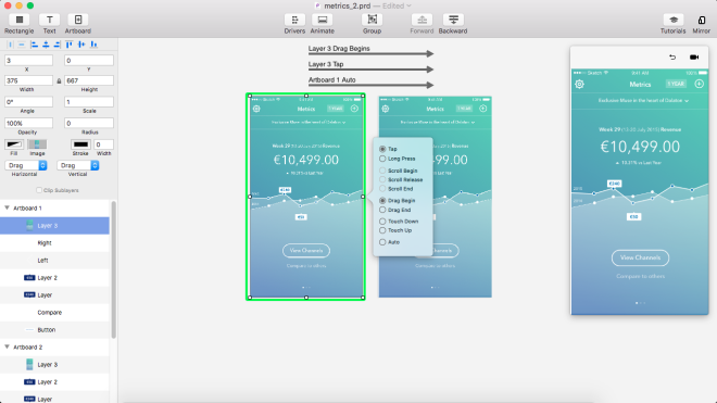
Principle is probably one of the easiest-to-use tools out there, giving designers the ability to create high-fidelity prototypes in a very short period of time, with the great addition of a timeline viewer for better animation handling. If you’ve ever used Keynote for prototyping, you’ll find yourself at home, with an out-of-the-box “Magic Move” transition as well as a variety of tools for advanced transition handling.

Integration with Sketch is excellent, allowing direct copy-paste of layers and groups, which saves time from importing/exporting particular elements – a time-consuming, repetitive task most designers prefer to avoid.

principle-screenshot

Framer

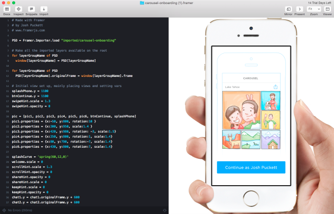
Framer is one of the most advanced prototyping tools out there, mainly because it’s based on code. Unlike Principle, there is no fancy WYSIWYG editor and Drag & Drop interface.

All the interactions and animations are done through CoffeeScript/JavaScript. This naturally results in a steeper learning curve, but on the bright side it means designers can prototype pretty much anything they like.

http://share.framerjs.com/a0aaba2lyu5l/

Framer has a very strong community and an unending collection of examples and tutorials to learn from, which makes it one of the most solid tools for prototyping for people who aren’t afraid of code. It features integrations for both Photoshop and Sketch, allowing for easy asset importing straight from the designs. Prototypes can be viewed on an actual device as well, like all of the other popular tools out there.

Quartz Composer, Origami, Form

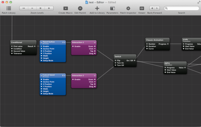
Besides purely code-based tools like Framer, and completely WYSIWYG tools like Principle, there is another set of tools that utilize the so-called Visual Programming or Node based Programming. Tools like Quartz Composer or RelativeWave Form (now acquired by Google) let users prototype through building blocks (called patches) that are connected through noodle-like arrows, in order to describe interaction and transitions between states. Although these tools have a much steeper learning curve than Principle, they also allow for more advanced animations and interactions between states – making them an alternative for code-based tools like Framer.

Summing it up

Product Company Cost Advanced animation features Requires coding skills Overall
Invision Invision Free for 1 project, up to 25$/mo for unlimited No No For quick flow prototypes and simple animations. Good collaboration features.
Marvel Marvel Free with limited features, up to 15$/mo No No For quick flow prototypes and simple animations.
Framer Framer 99$ one-off Yes Yes Very detailed prototypes. Steep learning curve. Based on code (Javascript/Coffeescript)
Principle Principle 99$ one-off Yes No Easy to create prototypes and export video. Uses a Visual/WYSIWYG Editor.
Quartz Composer Apple Free (included in the Xcode Development enviroment) Yes No Very detailed prototypes. Steep learning curve. Based on visual programming (nodes).
Form RelativeWave, acquired by Google Free Yes No Very detailed prototypes. Steep learning curve. Based on visual programming (nodes).

For the majority of designers who want basic UI flow prototyping and team collaboration, Invision or Marvel will cover most of their needs, while requiring little to no time to pick up and enabling them to start prototyping right away. When it comes to more advanced transitions and animations, Principle is an excellent choice, taking into account the exceptional ease-of-use and time needed to come up with a solid result. For even more advanced interactions designers can use either Framer if they’re into coding or a Node-based tool like Quartz/Origami or Form if that type of visual programming appeals to them.

One thing is for sure, modern designers should master prototyping and interaction design as soon as possible. Tools might change, but incorporating rapid prototyping and motion design in their workflow will change their perspective and potential and undoubtedly help them create outstanding experiences.

Categories
Tools

Are prototyping tools becoming essential?

How do you design the UI for a new app or feature? Good old fashioned pencil and paper? Photoshop or Sketch? Perhaps a wireframing tool like Balsamiq? Maybe you build clickable mockups or fully interactive prototypes? However you go about it, using prototyping tools to get some feedback on a design before it’s fully coded is a great way to save time and effort.

prototyping-tools-developer-economics

When building an app for a client, they’re usually a lot happier if they can see and touch what they’ll be getting before it’s built. For your own apps, being able to rapidly iterate on the design with prototypes can get you to market with a quality product much faster. There’s been a lot of activity in the prototyping tools space over the last year or two, providing a variety of ways to build brilliant prototypes. In this post we’ll look at some of the most interesting and promising ones.

Animation era

In iOS 7 Apple made a major change to their UI design. The old realistic textures and skeuomorphic design elements were out and flatter, cleaner look was in. Many of the hints at what interface elements were for, or affordances in designer-speak, are now gone – replaced by animations that make it clear what’s happening as you start to interact with the interface. This arguably makes it harder for complete beginners to discover functionality but also makes it easier to understand what’s happening and how apps work. Well designed animations can delight and surprise, making the whole experience more engaging. The danger here is that developers building custom UIs in a similar style can mimic the look of the new UI without adding the animations. This effectively takes away almost everything that helps a user learn how to interact with the app. [tweetable]Animation became essential to a good UI design[/tweetable]. At the time there were almost no tools for designers to help them create or communicate this aspect of the user experience – developers largely had to add these animations in code and tweak parameters across many slow and painful iterations to get them right.

In the Android 5.0 update last year, Google has also adopted a much more minimalist UI style – they’ve called it Material Design. Here also, animation is a core part of the user experience; this is made very explicit in their design guide. Fortunately we’re now in a much better place in terms of tooling to design and prototype these animations. Which tools you’ll want to use is likely to depend on your current process, what sort of app you’re building and what level of fidelity you want to achieve in the prototype.

Exploring ideas

If you primarily want to create a prototype to explore an app idea or communicate about one, then it’s hard to beat the efficiency of pencil sketch on paper. That’s fine for showing a basic app layout but what if you want to explore interactions. Prott lets you capture your sketches and turn them into interactive prototypes that are fully tappable, along with custom gestures and transition animations. The tool also has collaboration functionality built in.

Prott Web UI
Prott Web UI

For those who prefer to start sketching out their ideas in a digital form but want a low-cost and low-effort way to add some basic interaction and animation, Apple gave us a peek at part of their prototyping process in one of the talks at WWDC (video requires developer login and Safari). They use Keynote! Creating slides with the dimensions of a device screen and animating from one to the next (particularly the “Magic Move” animation) allows for a surprising amount of sophistication. Since there’s a Keynote app for iOS devices too, you can actually preview the designs on the device. The major restriction here is that you can’t tap different areas to cause different actions – tapping anywhere transitions to the next slide, so you have to prototype individual flows through the app rather than the whole thing.

If you’re only designing for iOS and only want to use standard UI elements and screen transitions, then a fun alternative for exploring new ideas on the go is AppCooker. This is an iPad app for designing iPhone and iPad apps. It’s necessarily limited compared to many desktop tools but still very capable. There’s no custom animation support here though and while you can import images, it’s not really suited to designing a custom UI.

High fidelity prototypes without code

The majority of designers have limited coding skills. Being able to create a basic page layout and style it with HTML and CSS is an excellent start but it doesn’t get you to a place where you can easily build screen transitions or custom animations. Professional animators have almost always had tools that didn’t require coding but there was nothing for app designers. Facebook started using Apple’s Quartz Composer, a motion graphics tool, for prototyping. They built a toolkit on top of it for prototyping apps and released it for free as Origami. This is a highly capable toolset but since it wasn’t originally built for for designing apps it’s somewhat complex and difficult to learn and use. Quartz Composer itself is also not very actively maintained or stable.

Quartz Composer with Origami

For anyone that wants a similar tool to Origami that’s easier to use there are a couple of excellent new options. If a complete freedom is what you want then Form is an excellent option. It was released by RelativeWave as a paid tool but then rapidly acquired by Google and made free. They initially launched for iOS only with plans announced to also support Android. With the tool in Google’s hands we can assume that Android support will come quickly. Like Origami, Form provides a node and graph based visual programming environment. They also have a viewer app so you can preview the design on as many devices as you like and it updates automatically as you make changes.

Form Mac App
Form Mac App

If you want to build prototypes that look and feel just like native apps using the built-in OS frameworks then Pixate is definitely worth checking out. It lets you build iOS and Android prototypes that use the native UI components directly. You can add your own custom styling and animations in a visual programming environment. The Pixate team are currently working on direct import functionality from Photoshop and Sketch, so it can be added seamlessly to existing static design workflows. They’re also planning to add native code export, so that when a design is complete, the native code generated for it can be used as the basis for the final app UI. Generated code doesn’t have a great history of being maintainable but if they can pull it off it would be a killer feature.

EDIT: Just after this was published, Pixate added a free tier that lets you use all of their features for 1 app.

Pixate Web UI
Pixate Web UI

HTML5-based solutions

There are lot of prototyping solutions on the market that involve building app UIs with HTML5. Some of them are for custom designs and others provide libraries of native component clones. Some do both but very few provide a good level of support for custom animation. A couple of interesting exceptions are Proto.io and Framer.

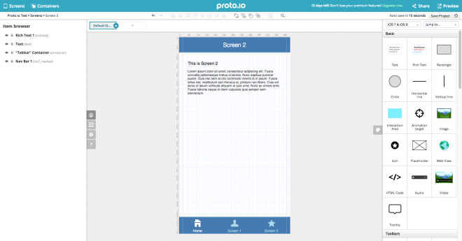
Proto.io is another non-coding solution which also has collaboration features, allowing you to get feedback from your team or a client. Unlike most of the tools on the market, it has a library of Windows Phone components as well as those for iOS and Android. You can test on real devices and export the final HTML5, which could be useful as the basis for a hybrid app, or just as a guide for the developers. It is a fairly expensive subscription solution compared to most of the others but would clearly produce an excellent impression in a consulting and contract development environment.

Proto.io Web UI
Proto.io Web UI

For designers that know their way around JavaScript (or CoffeeScript), developers with some design skills or those rare unicorns – true designer/developer hybrids – Framer is one of the most interesting options out there. Framer already has direct imports from Photoshop and Sketch and focuses on rapid iteration, including live device previews. If you do a lot of design work and iterating quickly is a key goal then Framer might be the tool to beat. The underlying prototyping framework, framer.js, is open source and could be used independently but a lot of the productivity boosting features are in the paid Framer Studio tool.

Framer Studio Mac App

What about functional prototypes?

What if your prototype needs to do more than just look and feel like the final app? Some app concepts can only really be understood and tested with live data or working features like using the device camera. Depending on the level of complexity it may even be possible to prototype these too. One option would be to hook up the output of an HTML5 prototyping tool to some real device functionality in a hybrid app. Another option is to build a fully functional prototype in a rapid application development tool like LiveCode. Although there may be areas where performance or functionality are lacking compared to building a native app, LiveCode has a visual UI design environment and good animation capabilities. It also makes it very quick and easy to add a database of real data or mobile specific features. When you get to this level of prototyping complexity, it starts to get time consuming and costly to build the prototype. It may make sense to only prototype parts of an application in this way, where it’s critical to get the design right before a very lengthy and expensive coding phase.

Consider prototyping your next app in more detail

[tweetable]The most common problem in software projects is not the technical execution[/tweetable], although that often takes longer than expected. By far the most common reason for app projects to fail is building the wrong thing. Although on the surface building a prototype only to throw it away might seem like wasted effort, it can massively reduce the risk of much more effort going to waste building something either the client doesn’t want or insufficient customers are willing to pay for. Prototyping the UI and putting it in the hands of clients or potential customers in a real device is one of the best possible ways of getting concrete, actionable feedback. Pick one of these tools, or find another that suits you better and give it a try with your next app. If you’re already a prototyping convert and we haven’t listed your favourite tool here then let us know in the comments.