Categories
Languages Platforms Tools

Comparison of 4 popular JavaScript MV* frameworks (part 1)

Finding a comprehensive comparison between any kind of JavaScript Frameworks, Libraries or Extensions is not hard these days. Especially when it comes to JavaScript MV* Frameworks, which are used to develop single-page applications (SPAs), and their notorious representatives, i.e. AngularJS, Ember, Backbone.js and newcomer React. A simple Google Search offers a plethora of technical comparisons to choose from.

mv-frameworks

Which are your favorite and worst frameworks? Take the survey, let us know and you can win awesome prizes and gear.

What they don’t usually mention, though, is the overall features those frameworks provide and how they compete for different use cases. Moreover, it is sometimes difficult, if not impossible, to find information on the origins of those Frameworks, i.e. how they have developed in time and, most importantly, how they will develop in the future.

This article is part 1 in a 2-part series, and will focus on comparing key features from some of the leading JavaScript MV*frameworks. In part 2, we’ll give you some insight on market-related qualities, followed by a conclusion.

Features Comparison

To get our comparison started, we will focus on the heavy-weight and most promising features you, as a developer, expect from a JavaScript MV* Framework.

Dynamic UI Binding

Dynamic UI Binding is not just passing data to our View or template at page load. You want to automatically have the View update when the data of the underlying Model changes. That being said, you may want to have a look at the following jsfiddle examples to get an idea of the huge improvement provided by dynamic UI binding over traditional server-side static data binding.

Ember.js:

Ember uses Handlebars as the default templating engine. To update a value, which is bound to the UI, you have to use a specific setter method on your Model while Handlebars takes care of rendering your page. Additionally, Ember offers much more binding options, such as its capability to have your Model in either a one or a two-way binding mode between a View or even another Model.

Angular.js:

In contrast with Ember’s approach, Angular.js allows you to use UI binding at plain object or even property level. At the end of every code execution, $scope.$apply() is run to check whether the value has changed and calls $scope.digest() to update your bindings. This may seem like a possible performance issue at first glance, but bear in mind that it allows you to update more than one binding simultaneously without requiring time-consuming DOM updates after each setter call. So the DOM rendering is triggered only once after you updated as many of the Model’s properties as you wish rather than being triggered after every single value change, like in Ember’s setter approach. Having all the magic happen in $scope.$digest() you don’t need to call your UI-Binding-Buddy yourself and even the $scope.apply() call is handled by Angular automatically (e.g. after events, controller init, http callback, etc).

React:

One of React’s rich UI Features is the straightforward linking of states directly to the UI. Since the UI is thought of as the representation of different states of a React Component, you just have to manage your states with the magical #setState(state, callback) method. The state parameter is passed as an object and will be merged into the internal state reference of your React Component. Meanwhile, React takes care of all the updating and re-rendering of your interface using the render method. The callback parameter from setState is optional and can be registered so you are informed after the UI update.

Reusable Components

While all frameworks provide out-of-the-box functionality, you will inevitably end up with a lot of custom code. Assuming you are developing more than one applications, you would like to be able to reuse that code, right?

Ember.js:
Ember is making use of a widget-based approach called Ember Components. It enables you to write your own ‘application-specific HTML tags’ using a Handlebars layout and the power of Ember’s backend infrastructure. Your custom element can be used in any Handlebars template you want. Keep in mind, though, that this is only possible at View level, while Controller level reuse is not supported by the Framework.

Angular.js:
Similar to Ember, Angular.js provides the ability to create custom HTML tags. Reusable components in Angular are called “directives” and are significantly more powerful than Ember Components. In fact, you will be able to create your own semantic and reusable HTML syntax using those directives. On the other hand, you may also make use of Angular’s extend or mixin system like in Backbone.js and React.

Backbone.js and React:
The way Backbone.js and React solve reusable components is not new, yet it is very reliable. They both use the mixin system for code reuse. You may know this feature already from the dojo toolkit and might remember how powerful mixins can be. Both Backbone and React let you use mixins at view or even controller level, so that your components are not forced to be UI-related and may contain just some utilities or even complex program logic.

Routing

The simplest routing infrastructure a MV* JavaScript Framework can offer is mapping functions to URLs, similar to their server-side relatives (e.g. Grails, Spring, ASP.NET, CodeIgniter). For Single Page Applications (SPAs) a URL is whatever follows the hashtag (or might even be full path assuming HTML5 push-state is enabled). This routing functionality is essential for any self-respecting SPA.

Ember.js:

The routing in Ember.js is quite intuitive, since you do not even need to provide a path for your route, as long as you follow the naming convention. You just provide the View and an optional Model to the route and there is no need for any kind of controller (as exhibited in the Fiddle above), unless you are planning to do some advanced stuff in your application.

Angular.js:

In contrast to Ember’s convention-over-configuration routing mechanism, Angular.js requires a template and even a controller to its router configuration. You have to manage your template and controller manually – but you can do that almost without restrictions.

Backbone.js:

Similar to Angular.js you provide a View with a Template for your route. The actual replacement of the DOM is done manually by instantiating the View and updating the DOM in your container node with the rendered view template. At the end of your routing configuration you just have to tell Backbone to listen for URL changes with the command Backbone.history.start().

Pit Stop – Concluding the Feature Comparison

It is quite unfair to compare React with the likes of Ember, Backbone and Angular. First and foremost, React is new, while the latter are already established frameworks in the MV* universe. Secondly, React is not a framework, but rather a View engine – even though it competes extremely well in terms of features. In fact Facebook explains it better: “React is mostly used as the V in MVC”.

Let’s look again at our JavaScript MV* candidates.

Backbone doesn’t provide UI binding and does a really good job at reusable, components but loses some of its fanciness when it comes to Routing. Ember offers a slick routing mechanism, keeping things clean and simple by introducing naming conventions. Its UI Binding concept and use of Handlebars, which provides you with very nice benefits, is flawless. The only thing Ember lacks is the reuse of components at Controller level.

To conclude, Angular is our winner – so far. The approach of extending HTML with custom syntax, the easy-to-use data binding features combined with the power of mixins or extends and a clear routing mechanism makes Angular more than just a swiss JS-Knife. With its high abstraction level and a bunch of features it may be the choice for a full featured CRUD application – client sided.

Stay tuned to find out more about how our rivals compete in market penetration, community support, their estimated future usage and, of course, our final conclusion to help you back the right horse for your SPA.


In the meantime, tell us more about what you love or hate for each framework and you might win cool gear. Take the Developer Economics Survey.

Categories
Platforms

App Stores Growth Accelerates in 2014

2014 was quite an eventful year in our industry. Apple finally gave in to the big screen but also teased us with the small screen of the upcoming Apple Watch, and even surprised developers with Swift. Google wasn’t quiet either, revealing their vision for the future of UI with Material design and tackling wearables head-on. To celebrate such a great year, we’ll be taking a look at app store growth in 2014.

In this report we’ll be exploring the growth of each of these stores in 2014, but let’s start by establishing a baseline of how big each of the stores are, in number of apps, and how they got to where they are today.

app-store-growth-1

Looking at the chart above we can see all three stores really expanded their app catalog. It’s the kind of healthy growth you’d expect from an industry that’s still relatively new. The most obvious takeaway here, however, is that Google finally closed the gap and actually jumped ahead of Apple, ending the year with more than 1.43 million apps compared to 1.21 million. Amazon, although a distant third, grew its catalog by nearly 90% to 293k apps.

Google surpassed Apple for number of new apps for the first time in 2014

app-store-growth-2

Looking at the number of app developers who publish apps for the different stores, we see a familiar picture. Google Play’s developer community grew tremendously in 2014, exceeding Apple for the 3rd year in a row. In fact, [tweetable]Google Play is distributing apps from nearly 400k different developers[/tweetable]. This is a much higher number than what we observed in last summer’s report on app developers, meaning the Play store saw rapid growth in the last two quarters of the year.

Google’s developer community continues to grow faster than Apple’s for the 3rd year in a row

More apps than ever!

app-store-growth-3

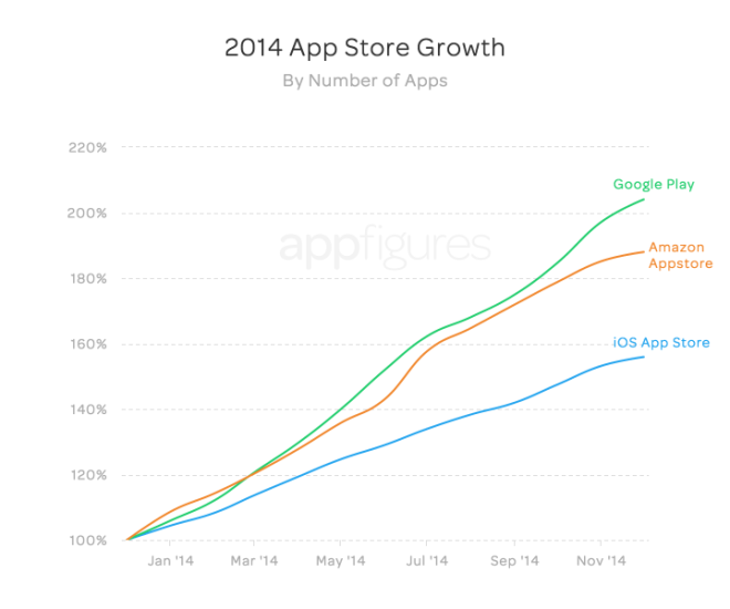
App development is certainly on the rise and the platform doesn’t seem to matter. [tweetable]In 2014, all three app stores grew by at least 50%[/tweetable] (by the way, when we say growth we mean the percent change from the end of the previous year). What’s interesting is that although Apple continues to grow strongly, it’s really Google Play that’s growing. In 2014, the number of apps distributed through Google Play has doubled. Amazon is also enjoying impressive growth, albeit from a much smaller base.

[tweetable]Google Play more than doubled in number of apps in 2014[/tweetable]

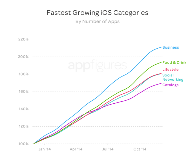
We initially only set out to look at aggregate growth, but with so much data at hand, we just couldn’t stop. So TL;DR Let’s have a look at the top 5 categories with most growth during 2014:

app-store-growth-4

We expected to see Business and Games rank very high as both are fairly mainstream, but Food & Drink, with the second largest growth, was certainly a surprise. Keep in mind, for the comparison to be apples to apples, these charts look at growth and not total size.

More than 128k new Business apps were released in the iOS App Store in 2014

app-store-growth-5

On Google Play, Games are in abundance with the category more than doubling in size. Interestingly enough, although tiny in comparison, the Photography category saw abnormal growth in 2014. Selfie Stick anyone?

Developers. Developers. Developers.

This is surely amazing growth, but are those new apps being published by new developers, or is the catalyst for this massive increase in apps a result of incumbents expanding? You’re about to find out.

app-store-growth-6

More developers joined Google in 2014 than Apple and Amazon combined! With developers flocking to Google Play, the store has reached a new milestone: 388k developers — more developers than Apple (with 282k developers) and Amazon (with 48k developers).

More developers released apps for Google in 2014 than Apple and Amazon combined!

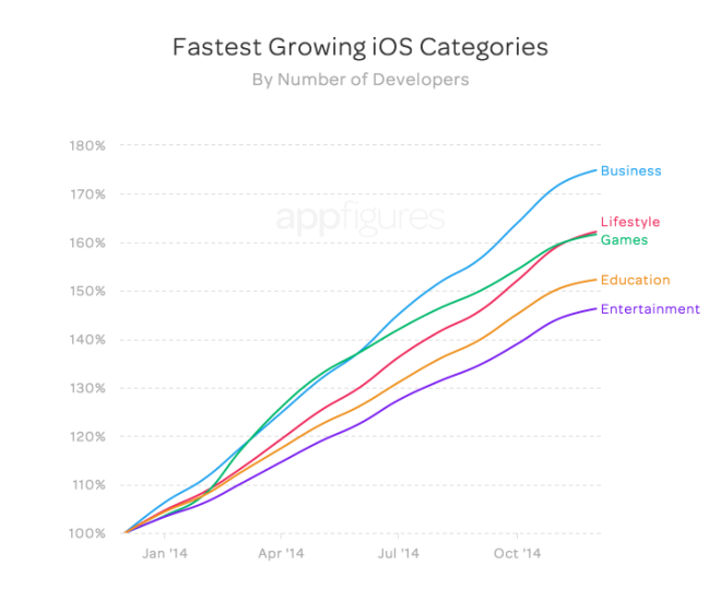
Let’s break this down by categories:

app-store-growth-7

We can see the relationship here between app growth and new developers, with most new Apple developers publishing business apps. What’s interesting is how games started off slow and sped up around March, catching up with the steadily growing lifestyle category. It’s no surprise that Apple developers, much like their Google counterparts, are focusing on mainstream apps.

app-store-growth-8

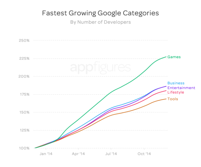
The amazing growth in games we mentioned earlier correlates directly to developers. The category saw the highest number of new developers, more than the business and entertainment categories that are tied for second place.

Most new Google developers focus on games, Google Play’s fastest growing category

There you have it, a whole year of amazing growth by the numbers.

[tweetable]2014 was certainly the year for Google Play growth[/tweetable]. Kudos to the teams who run the store and help developers! With the most apps and largest developer community, Google Play is starting the new year with a kick. Market fragmentation and varying device capabilities don’t seem to detract developers from making Android apps. But, with the upcoming Apple Watch, Swift, and a larger screen, Apple is giving developers a lot to be excited about.

Categories
Tools

Go ahead and add that extra ad library, but be careful about which one you add

In our case study we started with a set of 236,245 free to download Android apps from the Google Play store mined in 2011. Overall we found that the apps connected to 72 different ad networks through the respective libraries. In all there were three key findings in our study:

using-ad-libraries

Finding 1: Developers integrated more than one ad library quite frequently.

Fig 1. Number of apps (y-axis) that have a particular number of ad libraries (x-axis).

We find that most apps have only one ad library in them. However, at least 42,206 of the apps with ad libraries in them have two or more ad libraries. Fig. 1 shows a breakdown of the number of apps based on the number of ad libraries integrated in the apps. We even find eight apps with as much as 28 ad libraries!!

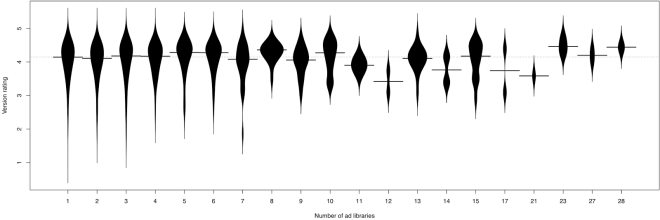
Finding 2: We found no evidence of a relationship between the number of ad libraries and the user rating of an app.

Fig 2. Bean plot of apps with a specific number of ad libraries and their user rating. The long dotted line and the line across each beanplot represent the median rating of all the apps and the median rating of the apps that integrate a particular number of ad libraries, respectively.

In Fig. 2 we break down the data and show more details by means of a bean plot of the rating of apps grouped by the number of integrated ad libraries. Bean plots show both the median value for the rating (indicated by the solid horizontal line), and the actual distribution (the width of the curve at any point in each bean plot indicates the number of apps with a particular rating). Since app ratings can be biased by a few raters, in the above Figure and the rest of the study, we filtered out apps with less than 10 raters and fewer than 2 releases in an entire year (unmaintained apps), which resulted in a set of 13,983 versions distributed across 5,937 different apps.

The Spearman rank correlation (correlation among the relative ranks rather than the actual values) between the number of ad libraries integrated in an app and the rating of the app is 0.016. Such a weak correlation illustrates that there is no relationship between the number of ad libraries in an app and the rating of the app.

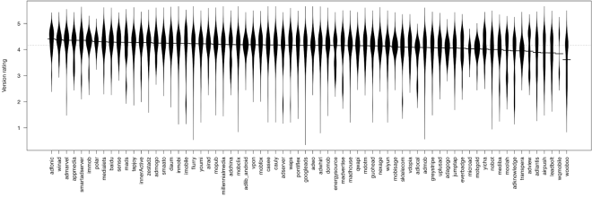
Finding 3: Apps that integrated certain specific ad libraries had a noticeably lower ratings.

Fig 3. Bean plot of apps that integrate a specific ad library and their user rating. The long dotted line and the line across each beanplot represent the median rating of all the apps and the median rating of the apps that integrate a particular ad library, respectively.

We observe that ad libraries with a highly intrusive behaviour result in complaints from app users, and in some occasions ruin the users’ perceived quality of the app. We find comments such as: “Good game, bad ads. I was loving the game until I noticed it put a new shortcut called ‘Apps’ on my launcher. Sorry, but if your idea of advertising is putting sh*t in launcher pages or notifications then I’m not interested. Keep ads INSIDE the app.”. At the time of our study, apps that included Wooboo, Leadbolt and Airpush all had lower ratings. We found that these ad libraries had an intrusive behaviour (as explained in more detail in our paper). Recently, Google Play updated its policies to encourage the app developers to be more conscious with ad libraries that have highly intrusive behaviour. They also updated their ad policy in mobile apps which has forced ad libraries to either change or risk not being included.

Recommendation

Given a certain real estate space that the ads will occupy on the screen of a device (control variable), app developers can add as many ad libraries as needed to increase the fill rate (ratio of number of ads received to the number of ads requested) without impacting their ratings. However, developers need to be careful and selective about the specific ad libraries that they integrate.

You can find more details about the case study in our paper published in the Nov-Dec 2014 issue of IEEE Software. (Preprint)

Categories
Tools

Are prototyping tools becoming essential?

How do you design the UI for a new app or feature? Good old fashioned pencil and paper? Photoshop or Sketch? Perhaps a wireframing tool like Balsamiq? Maybe you build clickable mockups or fully interactive prototypes? However you go about it, using prototyping tools to get some feedback on a design before it’s fully coded is a great way to save time and effort.

prototyping-tools-developer-economics

When building an app for a client, they’re usually a lot happier if they can see and touch what they’ll be getting before it’s built. For your own apps, being able to rapidly iterate on the design with prototypes can get you to market with a quality product much faster. There’s been a lot of activity in the prototyping tools space over the last year or two, providing a variety of ways to build brilliant prototypes. In this post we’ll look at some of the most interesting and promising ones.

Animation era

In iOS 7 Apple made a major change to their UI design. The old realistic textures and skeuomorphic design elements were out and flatter, cleaner look was in. Many of the hints at what interface elements were for, or affordances in designer-speak, are now gone – replaced by animations that make it clear what’s happening as you start to interact with the interface. This arguably makes it harder for complete beginners to discover functionality but also makes it easier to understand what’s happening and how apps work. Well designed animations can delight and surprise, making the whole experience more engaging. The danger here is that developers building custom UIs in a similar style can mimic the look of the new UI without adding the animations. This effectively takes away almost everything that helps a user learn how to interact with the app. [tweetable]Animation became essential to a good UI design[/tweetable]. At the time there were almost no tools for designers to help them create or communicate this aspect of the user experience – developers largely had to add these animations in code and tweak parameters across many slow and painful iterations to get them right.

In the Android 5.0 update last year, Google has also adopted a much more minimalist UI style – they’ve called it Material Design. Here also, animation is a core part of the user experience; this is made very explicit in their design guide. Fortunately we’re now in a much better place in terms of tooling to design and prototype these animations. Which tools you’ll want to use is likely to depend on your current process, what sort of app you’re building and what level of fidelity you want to achieve in the prototype.

Exploring ideas

If you primarily want to create a prototype to explore an app idea or communicate about one, then it’s hard to beat the efficiency of pencil sketch on paper. That’s fine for showing a basic app layout but what if you want to explore interactions. Prott lets you capture your sketches and turn them into interactive prototypes that are fully tappable, along with custom gestures and transition animations. The tool also has collaboration functionality built in.

Prott Web UI
Prott Web UI

For those who prefer to start sketching out their ideas in a digital form but want a low-cost and low-effort way to add some basic interaction and animation, Apple gave us a peek at part of their prototyping process in one of the talks at WWDC (video requires developer login and Safari). They use Keynote! Creating slides with the dimensions of a device screen and animating from one to the next (particularly the “Magic Move” animation) allows for a surprising amount of sophistication. Since there’s a Keynote app for iOS devices too, you can actually preview the designs on the device. The major restriction here is that you can’t tap different areas to cause different actions – tapping anywhere transitions to the next slide, so you have to prototype individual flows through the app rather than the whole thing.

If you’re only designing for iOS and only want to use standard UI elements and screen transitions, then a fun alternative for exploring new ideas on the go is AppCooker. This is an iPad app for designing iPhone and iPad apps. It’s necessarily limited compared to many desktop tools but still very capable. There’s no custom animation support here though and while you can import images, it’s not really suited to designing a custom UI.

High fidelity prototypes without code

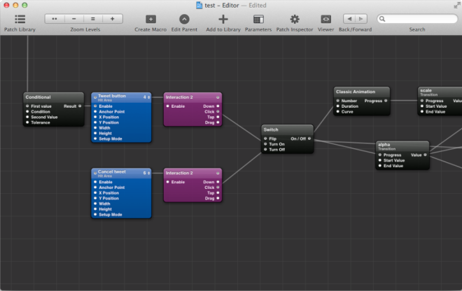
The majority of designers have limited coding skills. Being able to create a basic page layout and style it with HTML and CSS is an excellent start but it doesn’t get you to a place where you can easily build screen transitions or custom animations. Professional animators have almost always had tools that didn’t require coding but there was nothing for app designers. Facebook started using Apple’s Quartz Composer, a motion graphics tool, for prototyping. They built a toolkit on top of it for prototyping apps and released it for free as Origami. This is a highly capable toolset but since it wasn’t originally built for for designing apps it’s somewhat complex and difficult to learn and use. Quartz Composer itself is also not very actively maintained or stable.

Quartz Composer with Origami

For anyone that wants a similar tool to Origami that’s easier to use there are a couple of excellent new options. If a complete freedom is what you want then Form is an excellent option. It was released by RelativeWave as a paid tool but then rapidly acquired by Google and made free. They initially launched for iOS only with plans announced to also support Android. With the tool in Google’s hands we can assume that Android support will come quickly. Like Origami, Form provides a node and graph based visual programming environment. They also have a viewer app so you can preview the design on as many devices as you like and it updates automatically as you make changes.

Form Mac App
Form Mac App

If you want to build prototypes that look and feel just like native apps using the built-in OS frameworks then Pixate is definitely worth checking out. It lets you build iOS and Android prototypes that use the native UI components directly. You can add your own custom styling and animations in a visual programming environment. The Pixate team are currently working on direct import functionality from Photoshop and Sketch, so it can be added seamlessly to existing static design workflows. They’re also planning to add native code export, so that when a design is complete, the native code generated for it can be used as the basis for the final app UI. Generated code doesn’t have a great history of being maintainable but if they can pull it off it would be a killer feature.

EDIT: Just after this was published, Pixate added a free tier that lets you use all of their features for 1 app.

Pixate Web UI
Pixate Web UI

HTML5-based solutions

There are lot of prototyping solutions on the market that involve building app UIs with HTML5. Some of them are for custom designs and others provide libraries of native component clones. Some do both but very few provide a good level of support for custom animation. A couple of interesting exceptions are Proto.io and Framer.

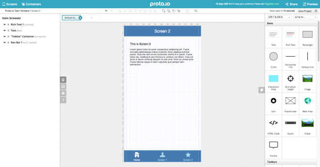
Proto.io is another non-coding solution which also has collaboration features, allowing you to get feedback from your team or a client. Unlike most of the tools on the market, it has a library of Windows Phone components as well as those for iOS and Android. You can test on real devices and export the final HTML5, which could be useful as the basis for a hybrid app, or just as a guide for the developers. It is a fairly expensive subscription solution compared to most of the others but would clearly produce an excellent impression in a consulting and contract development environment.

Proto.io Web UI
Proto.io Web UI

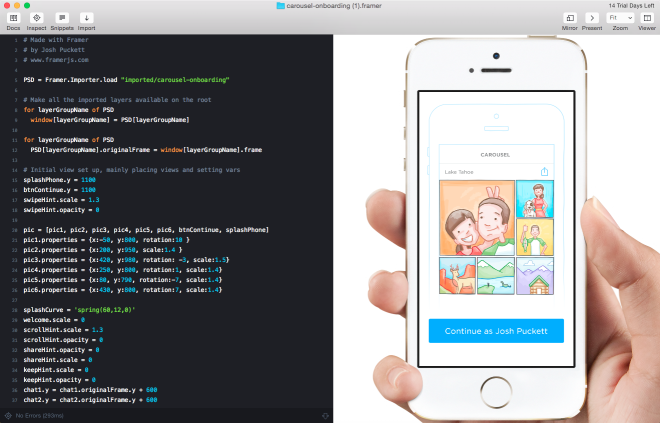
For designers that know their way around JavaScript (or CoffeeScript), developers with some design skills or those rare unicorns – true designer/developer hybrids – Framer is one of the most interesting options out there. Framer already has direct imports from Photoshop and Sketch and focuses on rapid iteration, including live device previews. If you do a lot of design work and iterating quickly is a key goal then Framer might be the tool to beat. The underlying prototyping framework, framer.js, is open source and could be used independently but a lot of the productivity boosting features are in the paid Framer Studio tool.

Framer Studio Mac App

What about functional prototypes?

What if your prototype needs to do more than just look and feel like the final app? Some app concepts can only really be understood and tested with live data or working features like using the device camera. Depending on the level of complexity it may even be possible to prototype these too. One option would be to hook up the output of an HTML5 prototyping tool to some real device functionality in a hybrid app. Another option is to build a fully functional prototype in a rapid application development tool like LiveCode. Although there may be areas where performance or functionality are lacking compared to building a native app, LiveCode has a visual UI design environment and good animation capabilities. It also makes it very quick and easy to add a database of real data or mobile specific features. When you get to this level of prototyping complexity, it starts to get time consuming and costly to build the prototype. It may make sense to only prototype parts of an application in this way, where it’s critical to get the design right before a very lengthy and expensive coding phase.

Consider prototyping your next app in more detail

[tweetable]The most common problem in software projects is not the technical execution[/tweetable], although that often takes longer than expected. By far the most common reason for app projects to fail is building the wrong thing. Although on the surface building a prototype only to throw it away might seem like wasted effort, it can massively reduce the risk of much more effort going to waste building something either the client doesn’t want or insufficient customers are willing to pay for. Prototyping the UI and putting it in the hands of clients or potential customers in a real device is one of the best possible ways of getting concrete, actionable feedback. Pick one of these tools, or find another that suits you better and give it a try with your next app. If you’re already a prototyping convert and we haven’t listed your favourite tool here then let us know in the comments.